RDRDIGITAL

Max Rent a CarA rental website built around the trip.

Max rents cars from Gjilan and Pristina Airport. We designed and built a website that takes a customer from pickup dates to a complete booking request, with their documents, in Albanian, English, or German.

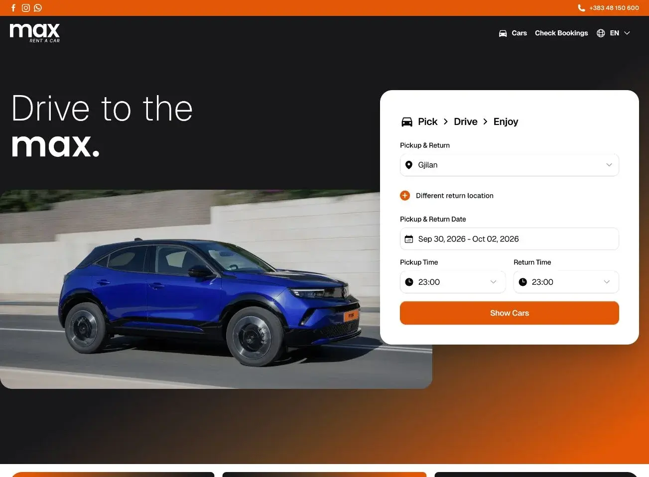
Max Rent a Car homepage with a blue Opel Mokka and the pickup search
Client
Max Rent a Car
Location
Gjilan, Kosovo
Sector
Car rental
Our role
Design, development, booking flow
Languages
Albanian, English, German

The website had to work like the rental desk.

At the desk, the staff confirm a car is free for the dates, take the customer’s details, check their documents, and answer questions. Online, all of that has to happen without anyone there to help, and without turning a short trip into paperwork.

Two pickup points

Cars leave from Gjilan and from Pristina Airport, and a trip can end somewhere other than where it started.

Three languages

The same booking has to read naturally in Albanian, English, and German, for people at home and people flying in.

Paperwork before the keys

Max needs contact details, an ID, and a driver’s license for every rental, ideally before the customer arrives.

Three rules for every screen

Trip first

Availability depends on place and time, so the site asks for both before it shows a single car.

Every car, the same way

One photograph style and one set of specifications, so the differences between cars are the real ones.

Never lose the thread

The trip and the chosen car stay on screen from search to the last form field.

The decisions behind the booking

Five choices shaped the experience. For each one, what we chose, the usual alternative, and what it cost.

Start with the trip, not the catalog

A car is only a real option if it is free on the customer’s dates at the customer’s pickup point. The search form comes first, so every car shown afterwards can actually be booked. On phones it sits above the headline and the photography.

Usual approach
Open with a fleet grid or a promotional banner and ask for dates later.
Trade-off
On a phone, the brand photography moves below the form. We kept it on the page, just not in front of the task.
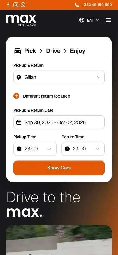
Mobile Max homepage with the pickup and return form above the headline
  1. Pick, Drive, Enjoy names the three stages before the customer starts.
  2. A different return location is one tap away, not a separate form.
  3. One action, Show Cars, leads straight to the available fleet.
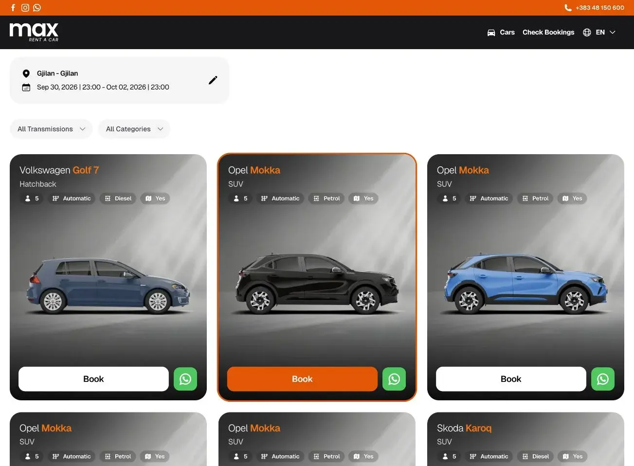
Make every car comparable at a glance

Each car is photographed from the side on the same studio backdrop, with the same four specification chips. The make is set in a regular weight and the model in orange, so a row of cards reads like a lineup.

Usual approach
A long sidebar of filters and mixed photography from different sources.
Trade-off
Only two filters, transmission and category. That suits a focused fleet, and it means each new car needs a photograph prepared to the same standard.
Max car listings with the trip summary, two filters, and vehicle cards
  1. The trip stays above the results, with an edit control instead of a new search.
  2. Two filters cover the choices that matter in this fleet.
  3. Seats, transmission, and fuel sit in the same place on every card.

Confirm the car before the paperwork

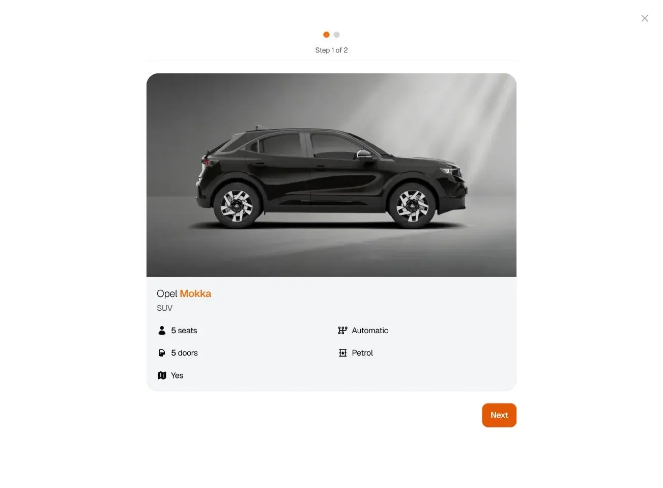
Booking opens in two steps. The first shows only the chosen car and its details, so the customer agrees on what they are renting before typing anything. The step indicator says how much is left.

Usual approach
A single long checkout page that mixes the car, the trip, and the form.
Trade-off
One more click before the form. In return, a wrong car is caught before the customer has entered their details.
First booking step showing the Opel Mokka and its specifications
  1. Step 1 of 2. The length of the booking is clear from the start.
  2. Seats, doors, transmission, and fuel, in plain words.
  3. A single Next action. Nothing else competes with it.

Keep the reservation in view while filling in details

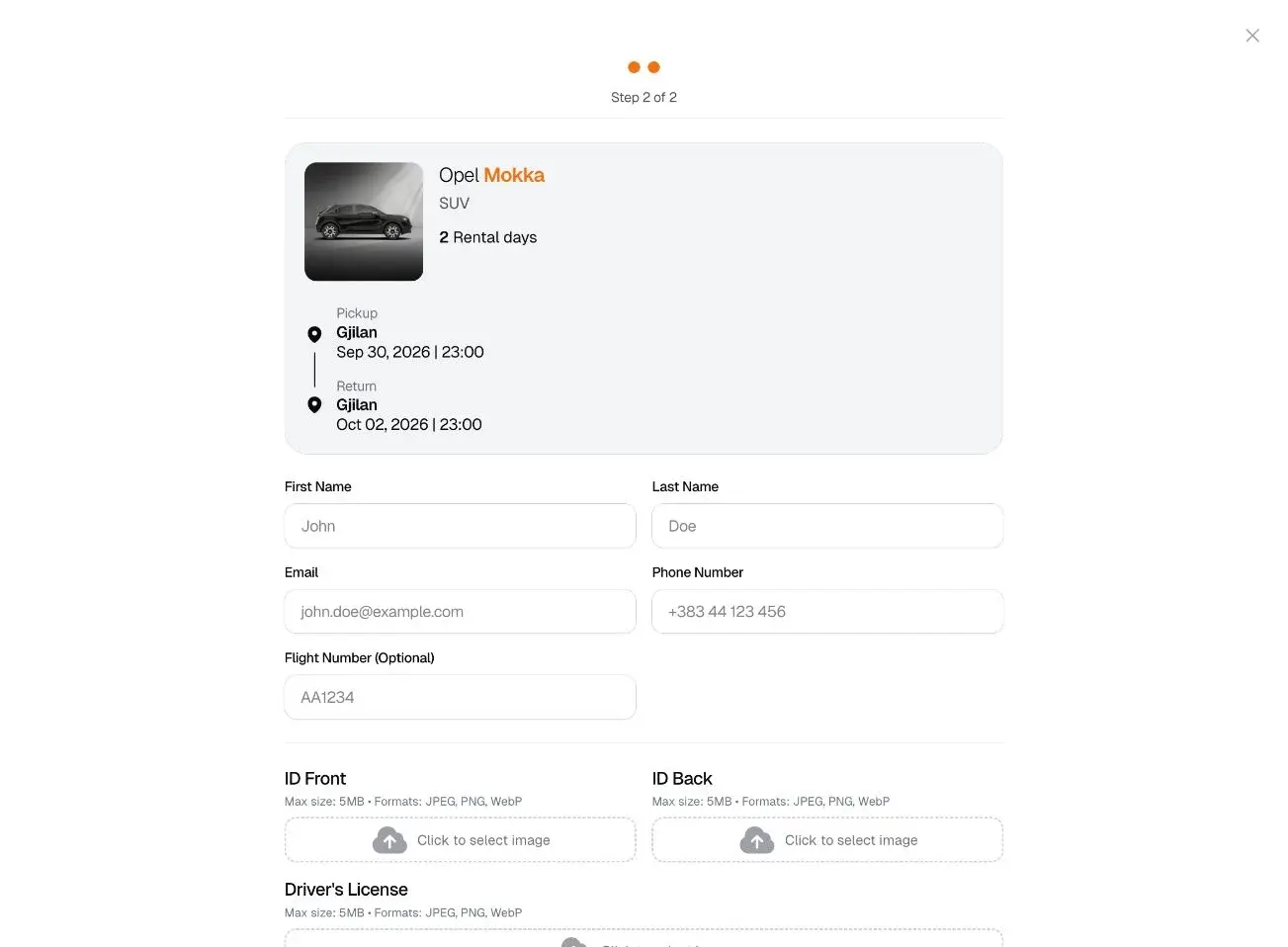
The second step opens with a summary of the car, the number of rental days, and the pickup and return, drawn as a short route. Identity documents and the driver’s license are uploaded here, so the handover at the desk can be quick.

Usual approach
Collect contact details only and check documents in person at pickup.
Trade-off
A longer form online. Fields that do not apply to everyone, such as the flight number, are marked optional.
Second booking step with the trip summary above the customer details form
  1. The rental length is counted for the customer.
  2. Pickup and return read as a route, with place, date, and time.
  3. Flight number is optional, for customers arriving at the airport.
  4. Upload limits and formats are stated before the customer picks a file.

Leave a human route open

Some customers want to ask a question before they commit. Every car card has a WhatsApp button next to Book, so the conversation starts about a specific car instead of a general enquiry.

Usual approach
A single contact page or a phone number in the footer.
Trade-off
Some bookings move to a chat instead of the form. For a local business, a conversation is a better outcome than a customer who leaves.
One Opel Mokka card with its Book button and WhatsApp button
  1. Book starts the two-step reservation.
  2. WhatsApp opens a chat about this car.

Designed in Max’s own colors

The interface takes its contrast from the Max logo: a near-black ground, a single orange for action, and type that pairs a light weight with a bold one. The same rules carry every screen, from the homepage headline to a specification chip.

Color

  • Max orange#E35707
  • Night#18181A
  • Panel#F3F5F7
  • White#FFFFFF

Type

The homepage headline, “Drive to the max.”, sets a light line against a bold one. Car names follow the same idea: the make in a regular weight, the model in orange.

Components

One card pattern for every car: name, category, the same specification chips, and two clear actions.

The finished journey, screen by screen

These are the actual screens from the live website. Select a step to see it.

Pickup and return search on the Max homepage

Screen from the live website.

View full-size screen (opens in a new tab)

Built for how Max works

The details that do not show in a screenshot, but decide whether a booking actually reaches the office.

Three languages, three addresses
Albanian, English, and German each have their own URLs, linked with hreflang tags so search engines show people the version in their language.
Booking lookup without an account
Customers check a reservation with their six-digit booking number and the email they used. There is no password to remember for a two-day rental.
Documents with the booking
ID front, ID back, and driver’s license are uploaded in the booking form, in JPEG, PNG, or WebP up to 5 MB each.
Pickup, return, and one-way trips
Gjilan and Pristina Airport are both pickup points, and a different return location is part of the same search.

What Max can do now

Book at any hour

Customers search, choose a car, and send their details and documents without waiting for the office to open.

Arrive with the paperwork done

Max receives contact details, identity documents, and the license with each booking request.

Find a booking again

A booking number and an email address are enough to look a reservation up.

Our role

  • Product and interface design
  • Booking flow
  • Multilingual website
  • Web development

Something similar in mind?

Tell us what your customers need to do. We’ll help you work out how the website can make it easier.